Top 50 Design Blog Articles and Sites From 2017

It’s nearly the the close of 2017. Lots has happened and I’ve been reading about UX, Design Thinking, Design Systems, Agile, Block Chain, Crypto currencies, Machine Learning, AI, Startups and plenty more. 2018 seems to be shaping up to be an exciting year for digital! (and maybe we’ll stop asking ourselves, why didn’t we all buy Bitcoins 5 years ago?)

Trends running into 2018

  • Better personalisation (Machine learning, AI) – With tech coming to the forefront we need to made experiences individual
  • Better Security all over – We need to prevent those Cryptocurrencies form being stolen!
  • Wider adoption of design processes in product management (Design Systems, Design Thinking leading to better product design
  • The new breed of disruptors taking on AI, Machine learnings and Cryptocurrencies
  • Chat Bots & Speech – More and more popping up as people test the benefits

Top 50 Design Blog Articles and Sites

The Ultimate Guide to Minimum Viable Product

You’ll know exactly what MVP is, how to do it and what tools to use.

Topics: mvp, lean startup, product management
Read time: 7 mins

The Most Important Rule in UX Design that Everyone Breaks

The psychological phenomenon discussed in this article is known as Miller’s Law.

Topics: ux,design
Read time: 5 mins

How to promote a blog post: the ultimate guide

you’ve written an awesome blog post that provides lots of value…now what? How do you get it in front of the right eyes, and as many pairs of eyes as possible? Promoting your blog posts the right way is just as important as writing amazing content.

Topics: blogging, content marketing
Read time: 10 mins

The non-techie’s guide to machine learning

So, machine learning. Is that like… AI? Dive in to the fundamentals of Machine Learning

Topics: machine learning, tech
Read time: 5 mins

Design Systems Handbook – DesignBetter.Co

A design system unites product teams around a common visual language. It reduces design debt, accelerates the design process, and builds bridges between teams – Check out this 7 step guide

Topics: invision, design, design systems
Read time: 7 mins

Running in Circles

Why Agile Isn’t working and what we can do differently

Topics: waterfall, agile
Read time: 6 mins

Certbot

Automatically enable HTTPS on your website with EFF’s Certbot, deploying Let’s Encrypt certificates

Topics:web development, https, ssl
Read time: 2 mins

Artwork Personalization at Netflix

Given the enormous diversity in taste and preferences, wouldn’t it be better if we could find the best artwork for each of our members to highlight the aspects of a title that are specifically relevant to them?

Topics: netflix, recommendations, personalisation
Read time: 11 mins

Design Principles

This site is an open source resource created to help us understand and write Design Principles.

Topics: design, principles, design systems
Read time: 5 mins

How artificial intelligence is revolutionizing the news business

Reuters is scooping its rivals using intelligent machines that mine Twitter for news stories.

Topics: artificial intelligence, news, trust
Read time: 6 mins

A brief guide to psychology principles in UX design

Discussing various psychology principles and their relevance in UX design

Topics: artificial intelligence, news, trust
Read time: 2 mins

Machine Learning for Marketers

A comprehensive guide to Machine Learning

Topics: marketing, startups, artificial intelligence
Read time: 7 mins

What is Blockchain Technology?

Few people understand what it is, but Wall Street banks, IT organizations, and consultants are buzzing about blockchain technology.

Topics: blockchain, bitcoin, beginners
Read time: 7 mins

Wireframes, flows, personas and beautifully crafted UX deliverables for your inspiration

Here are a few examples of UX deliverables that are well polished, legible and simple to understand

Topics: ux, deliverables, wireframes
Read time: 11 mins

The Font-end Checklist

The Front-End Checklist Application is perfect for modern websites and meticulous developers!

Topics: front-End, checklist, website design
Read time: 11 mins

Six Steps to Superior Product Prototyping: Lessons from an Apple and Oculus Engineer

Tips and advice to make your product prototyping strategy better

Topics: prototyping, product management, product
Read time: 15 mins

An Introduction to Scrollama.js

Scrollytelling can be complicated to implement and difficult to make performant. The goal of this library is to provide a simple interface for creating scroll-driven interactives and improve user experience by reducing scroll jank.

Topics: javascript, scrollytelling, waypoints
Read time: 3 mins

First Round Search

The best tactical advice in tech

Topics: startups, advice, news
Read time: 3 mins

20 Product Prioritization Techniques: A Map and Guided Tour

Although it’s not what we are hired to do, it’s something that we have to do to achieve our real goal: creating successful products that bring value to our customers and to the business.

Topics: product management, prioritization
Read time: 4 mins

How to Stop UX Research being a Blocker

Fitting research into agile teams

Topics: ux, research, agile
Read time: 7 mins

Fontjoy – Get smart font pairings in one click

Generate font combinations with deep learning

Topics: fonts, typography, design
Read time: 2 mins

The 8pt Grid: Consistent Spacing in UI Design with Sketch

Spacing is everything in UI design.Forget colour, forget typography. Nail the spacing and you’re half way there. Why?

Topics: grid, sketch, 8pt grid
Read time: 4 mins

Another Lens – News Deeply x Airbnb.Design

A research tool for conscientious creatives

Topics: design, design thinking, research
Read time: 6 mins

Haiku – design meets production

Craft imaginative UI components that snap into any app.
Code optional.

Topics: animations, sketch, ui
Read time: 3 mins

Search Engine Optimization (SEO) Starter Guide

If you own, manage, monetize, or promote online content via Google Search, this guide is meant for you.

Topics: seo, google, basics
Read time: 10 mins

A/B tests that do more than validate – Inside Intercom

A/B tests provide more than statistical validation of one execution over another. They can and should impact how your team prioritizes projects.

Topics: a/b testing, best practices
Read time: 2 mins

Material Design and the Mystery Meat Navigation Problem

In March 2016, Google updated Material Design to add bottom navigation bars to its UI library. This new bar is positioned at the bottom of an app, and contains 3 to 5 icons that allow users to navigate between top-level views in an app.

Topics:navigation, web design, android
Read time: 9 mins

UXmas – Wishing you a great experience through the festive season!

An advent calendar for UX folk

Topics:ux, articles
Read time: 5 mins

How to Build a Successful Team

Building a successful team is about more than finding a group of people with the right mix of professional skills.

Topics:management, team
Read time: 11 mins

1000 different people, the same words

What hiring language from 25,000 recent job descriptions tells us about corporate cultural norms

Topics:hiring language, job descriptions, corporate culture
Read time: 2 mins

The Role of the Founder/CEO: You Have One Job

Most people have a certain image in their minds when they think of a founder/CEO.

Topics:startups, expertise, leadership
Read time: 5 mins

8 simple rules for a robust, scalable CSS architecture

This is the manifest of things I’ve learned about managing CSS in large, complex web projects during my many years of professional web development.

Topics:css, architecture, scalable”
Read time: 15 mins

Intro to Framer

Design and code animations with Framer

Topics:prototyping, design, animation
Read time: 7 mins

Action vs indecision – Inside Intercom

One of the most expensive parts of running a startup isn’t the new feature you shipped that nobody used or the marketing experiment you ran that failed. It’s indecision.

Topics:principles, management
Read time: 1 mins

12 Things Product Managers Should Do in Their First 30 Days

Here are some tips for how to approach that first month. Emphasize these three areas: People, Product, and Personal:

Topics:product management, product
Read time: 4 mins

A Primer on Android navigation

Before digging into common navigation patterns, it’s worth stepping back and finding a starting point for thinking about navigation in your app.

Topics:navigation, android navigation, android
Read time: 11 mins

The Guide to Mobile App Design: Best Practices for 2018 and Beyond

So what exactly can be considered as “good experience”? Let’s explore the six fundamentals of mobile app design.

Topics:mobile, app, design
Read time: 6 mins

How to Create Influencer Roundups: Tips and Tools for Bloggers

n this article, you’ll discover a four-step plan to create effective influencer roundups.

Topics:outreach, content, blogging, influence
Read time: 7 mins

The Role Of Storyboarding In UX Design

In order to create better products, designers must understand what’s going on in the user’s world and understand how their products can make the user’s life better. And that’s where storyboards come in.

Topics:ux, research, storyboard
Read time: 11 mins

Best Tools for Web Designers to Use in 2018

The design world moves fast and there’s always new tools coming out. To stay ahead of the game requires an ear to the ground at all times.

Topics:tools, ux, ui
Read time: 7 mins

Looking to Horizon: Why We Built A Design System

Feather’s mission was to provide consistent and thoughtful experiences at scale. As the number of Feather’s components, patterns, and internal customers grew, this once-Hackathon passion project evolved into a well-supported team.

Topics:design system, twitter
Read time: 3 mins

Jobs-to-Be-Done in Your UX Toolbox

People want a quarter-inch hole, not a quarter inch drill

Topics:jtbd
Read time: 12 mins

Motion design for the web, iOS & Android with Haiku

JTBD provides a different way to think about solutions that compete for the same job:

Topics: android, animation
Read time: 3 mins

Lottie without After Effects

We designed Haiku from the ground up for animating UI components. Like Sketch, it is a simple tool with a specific purpose, and like AE, it is compatible with Lottie.

Topics: animation
Read time: 3 mins

I don’t care if you love red: how to work with your UX team, not against them

As a designer, I’m passionate about creating the right user experience. A great product should take you on a journey. It should feel seamless, clear, and fun.

Topics: ux, research, product
Read time: 7 mins

Team Alignment Map

An agile template to boost alignment in cross-functional teams: concrete discussions that bring concrete results.

Topics: collaboration, tool
Read time: 1 mins

8 Customer Discovery Questions to Validate Product Market Fit for Your Startup

During a typical diligence process, we will interview customers and might ask them questions like these…

Topics:product market fit, validation
Read time: 1 mins

Where Do We Put The UX Tasks?

I’ve seen teams try these three options to remedy the situation

Topics: ux, agile development
Read time: 3 mins

Where should designers sit? Making cross-functional design teams work

Traditionally design teams have been centralized, such that all designers worked on the same team and would take on projects together.

Topics: design, cross-functional, teams
Read time: 5 mins

Why Design Systems Fail

I’d like to go over a few considerations to ensure design system success and what could hinder that success.

Topics: design system
Read time: 10 mins

Minimalism Inspiration in Packaging Design

design

Packaging, of course is created to protect the products inside, it’s there to inform the customer of the product and act as a means of promotion of the brand, but design enthusiasts know that packaging has a secondary dimension: to create a thing of beauty that upholds a brand’s identity and engages the audience their target audience.

Today, we live in a world where we are saturated with information, images and messages. Everything we could ever want to know is right at our fingertips, but with this comes an overwhelming sense of overload. It’s harder than ever to break through the noise and find calm and this has led design to adopt new minimalism. Designers are saying enough is enough and channelling the need for simplicity through distilled packaging design.

Minimalist design does not have to be blunt and cold, but instead can be used to articulate the important aspects of the packaging design, communicating the brand’s message clearly and evoking emotion in the customer. When executed correctly, this emotional connection encourages audiences to buy.

The Unboxing Experience

Today, we live such busy lives it can often seem there is no chance for us to slow down and enjoy the world around us and often we’re purchasing goods in a hurry. Great packaging design connects an emotional part of our psyche and brings increased pleasure from the purchasing experience.

We demand to be entertained today; the packaging we choose does not only have to protect the product inside but must act a way to bring pleasure to the user. Brands are looking to engage with their audience across multiple platforms in order to enjoy success.  This means guiding users to share their packaging experiences on social media and tap into the emotional needs of 21st century buyers. In a recent study, Dotcom found that nearly 4 in 10 consumers would share an image of a delivery via social media if it came in a unique package.


design1

Mandarin Natural Chocolate

In order to communicate with customers the simplicity of Mandarin’s chocolate, a simple design was needed. The brand only product confectionary made with organic cacao and cane sugar. The lettering against the plain background echoes the ethos of the brand by eliminating all that is unnecessary and focusing purely on quality.

Simple design is not the lack of imagination; moreover it is the result of extremely considered choices. Designer Takashi explains this:

“We felt that we wanted a typeface with pointed serif to express the sharpness we feel when we hold high-quality chocolate in our mouths,”

Businesses Adopting Minimalism

The minimalist movement is not slowing down, and for businesses that are looking to adopt these methods and do less with there are some basic steps to follow:

Create Value

Understand why your customers are choosing your products and make this the focal point for the design, whether this is value for money or a health benefit.

Use Colour

In minimal design, you can use colour to speak to your customers instead of words or graphics. This is a great way to signify flavours. Choose colours your customers can instantly recognise as representing a flavour to avoid any confusion.

Use Packaging Tape Effectively

If your e-commerce company is shipping items, the packaging can still enjoy minimal design. Ensure the unboxing experience is upheld using printed packing tape that represents your brand’s identity. The price is very similar to clear tape and you will enhance appeal whilst communicating your chosen message to your customer.

Stand out from the crowd

Minimalism is brave; it steps away from the flashiness of the early noughties and stands out for that reason.  Consumers have come to expect certain things from their packaging and are refreshed when the rules are broken. Why not make a bold claim as Boxed Water did to draw customers to your product?

Trident

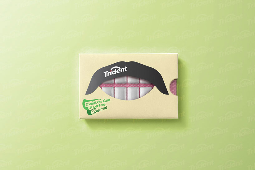
The key to successful packaging in 2016 is simplicity of the brand’s message. Trident has succeeded in this by communicating the purpose of their Xtra Care chewing gum product. Its purpose of the product is to protect teeth and gums from acid between meals. The design uses bright graphics as a mouth, the chewing gum visible through a window acting as teeth. This clever strategy removes the need for text and uses humour to connect with prospective customers.


trident

New Minimalism in 2016

Once, minimalism was the art of taking away but new minimalism is the art of using just enough. By focusing on the essentials brands are able to cut through the 21st century noise and communicate with a new sense of clarity. Customers are looking for a different experience from their packaging today. The packaging must inspire, entertain and bring joy all whilst conforming to the fundamentals of packaging protection and availability of product information. Brands, both big and small can use new minimalism to add, rather than detract from the packaging experience.


Whimsical, Surreal Illustrations with iStock’s Signature Artist – Iveta Vaicule

Illustrations are at the forefront of communications these days, with everyone from small businesses to major brands using them to make a visual connection.

63571513_740x862

Illustrations used to act as supporting elements to big beautiful photos on websites and campaigns, but now advertisers and designers are using illustrations more and more as the main vehicle for expressing their message

iStock by Getty Images Senior Manager of Illustration Jennifer Borton said. They can really provide a unique and personal stamp on any project.

Iveta Vaicule, one of Jennifer’s favorite illustrators, is creating her own mark on the illustration world. Born in Latvia and now living in Norwich, UK, she originally started her career as a graphic designer before realizing her true passion lied in illustration.

Illustration provides me with more freedom than graphic design, it feels more like ‘me,’” Iveta said. “I love the creativity and how you can put together a bunch of scribbles and something beautiful comes out of it.

Iveta’s signature hand-drawn style combined with the whimsical, childlike quality of her designs helps her stand out among other illustrators.

63784419_740x862

“Iveta’s style is very surreal and almost primitive — it’s deliberately clunky and very charming. Her color palettes are really bizarre and cool. She’ll take two colors that you would never think would work together and she crashes them together and it works beautifully,” Jennifer said. “I also love the texture she builds up. The more you look at her illustrations, the more you get drawn into the composition and start noticing all the little details she’s added.”

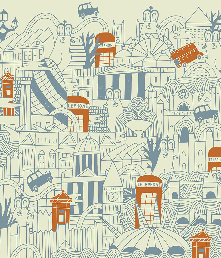
One of Iveta’s favorite topics to draw are cityscapes. Her illustrations provide a quirky, fun perspective of destinations across the globe from Moscow to Rio. Interestingly, she hasn’t actually been to most of the cities she’s drawn, and instead uses photographs as inspiration to create her own unique spin.

“She takes the buildings and landmarks and mashes them all together into these crazy compositions with a skewed viewpoint,” Jennifer said. “They’re really interesting and stand out among a sea of more straightforward, realistic depictions of these locations. It’s almost like she just draws whatever she wants.

And that’s exactly what she does.

23769164_740x862

It gives me great joy, excitement and happiness to create something. It’s a good way to express myself — it’s almost like a diary of my life. Looking at various illustrations of mine brings back memories of places, people, pets, happy and sad times from my past, I’m really just trying to draw for myself, that’s how I produce the best work. If you do something for yourself and other people like it, that’s a massive bonus.

This photo was inspired by a man I once dated a long time ago who was very good at playing piano and writing little songs. He was a very entertaining and interesting person but he didn’t pursue his dream of becoming a musician and instead, he sold pianos and caravans. He also couldn’t click his fingers. So in this illustration he is in a band, singing away and clicking his fingers too.

iStock are offering a free download of Iveta’s chosen image

Free Download
Free Download

[button url=”http://istockphoto.7eer.net/c/261011/258824/4205?u=http%3A%2F%2Fwww.istockphoto.com%2Fvector%2Fman-singing-snapping-and-planing-piano-in-the-band-gm464993388-59423702%3Fst%3Dd525181″ postid=”” style=”btn-primary” size=”btn-default” target=”_blank” fullwidth=”false”]Download Now[/button]

View Iveta’s collection and millions more royalty-free images at iStock.com

Leading E-commerce Website Design Trends of 2016

The ultimate goal of e-commerce websites is to get the conversion. Even leading e-commerce sites work for the same goal. And for the accomplishment of the goal, it is essential to include the leading e-commerce website designs that are in the trend now.

We have chosen some of the most trending e-commerce website designs for this year that are going to remain alive for longer. Thus, in the case, you are anywhere near to plan an e-commerce website, here are the leading elements that must be taken care of while designing the same.

Above the Fold Web Design

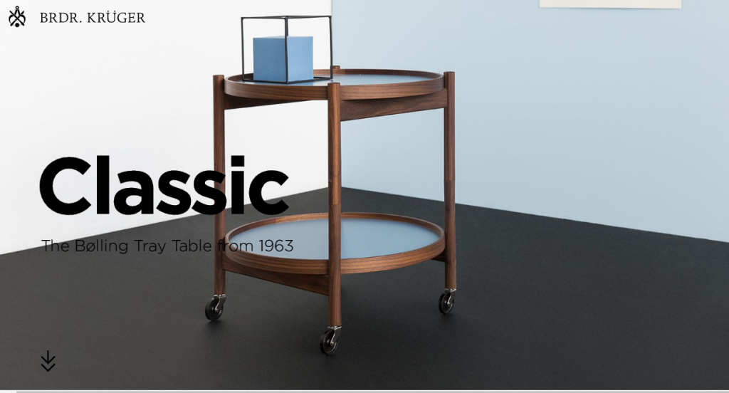
Emerged as an essential newspaper design, above the fold design got extremely popular for e-commerce websites also. The element is added to offer the most important content of the web above the fold. With this designing element in action, the visitors are presented with the most important web element just after they open a website.

The dimension of the fold varies for responsive & non-responsive layout. The most common dimensions are from 1024*786 pixels to 1280*1024, after reducing the browser navigation bar, scroll bar, window element, etc.

Flat Design

image001

The giant search engine Google along with Microsoft and Apple are also in support of flat design. There is nothing new about flat design but have suddenly become one of the most important web design trends now. Flat design is in trend not only because it is eye-pleasing but also because it is easier to understand.

For developers, the good news is that it is easy to develop and make responsive as well. More to this, the extraordinary elements of the flat design help users to concentrate on the web content.

Tiled Navigation

image003

Tiled navigation is extremely popular among e-commerce sites as it offers a captivating experience to the users. E-commerce websites offer a preview of the products in the form of tiles using images. These product images are not only high in resolution but also much more appealing if compared with the text for the similar product.

Thus, titled navigation is all that website owners can get benefited from. No website can bear the loss wherein visitors come to their website and leave the same without completing the desired action. Tiled navigation can thus be used to grab the attention of the visitors, hold them for longer and appeal them to accomplish the desired purchasing action.

Large and Flexible Typography

image005

Making use of large, flexible typography for the content adds more to this element. Content, on the other hand, should be centered to make it more engaging.

Large and flexible typography plays an important role in creating a robust brand identity, which additionally attracts potential visitors over the website. Adding this element easily guarantees the popularity of the website among the visitors.

Hamburger Menu

image009

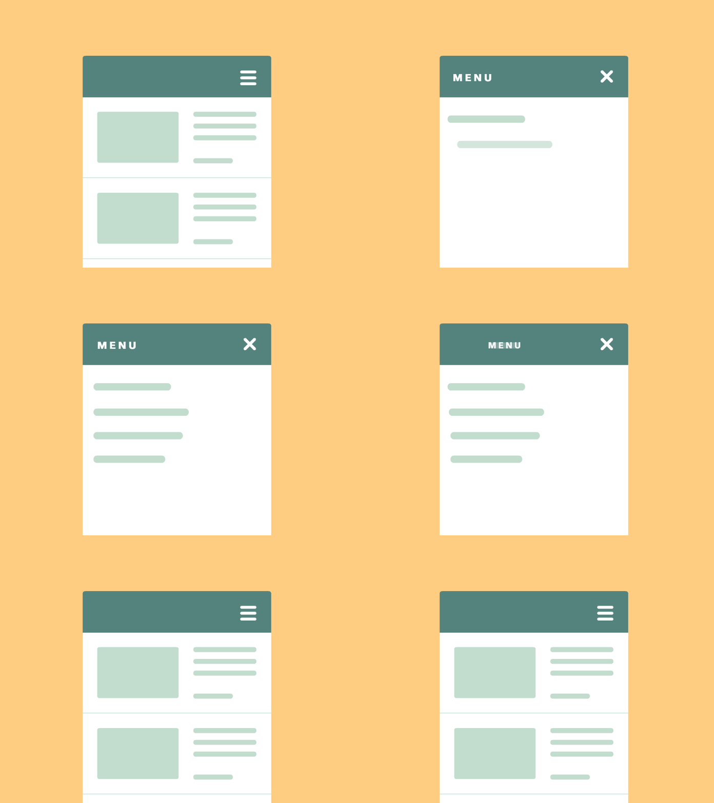
Hamburger menu helps website owners cut a lot of clutter on an e-commerce website and hide them behind these menus. These menus are used as an important element of mobiles only but today their usages have extended to desktop websites also.

image007

Hamburger menu is a wise choice for developers to save the considerable screen space. Besides this, improved user experience is an add-on when combining the effects of hamburger menu in any e-commerce website.

Good CTA Button

Call to action buttons are used for a variety of reasons. However, the main aim lies in getting visitors on the website and making them accomplish certain actions. These certain actions can let them to add a product to their cart, getting related information, downloading something or any other such stuff.

A good CTA is thus a chance provided to the user to accomplish any of the above-written examples. For the website owners, on the other hand, it is an opportunity to guide the users towards getting an easy conversion.

Hero Images

Vision is the strongest human sense and thus, the large and beautiful hero images are very much popular as the leading trend in the e-commerce website designing. Hero images have evolved to be a compelling element to grab users’ attention towards a website. Hero images above the scroll followed by a card based arrangement are slowly gaining the attention.

Most of the hero images are photographs that have some kind of relation with the content posted on the website. Such images drive the users towards the site. The soothing and pleasing colors of these images add more to the overall appearance of the website.

Rich Motion Animation

image012

Rich motion animation contributes to websites’ enhanced storytelling. This makes the browsing experience more interactive and entertaining for the visitors. Different websites make use of different animation techniques, and one of them is motion animation.

Human eyes are naturally drawn to motion, which makes motion animation a perfect element for an e-commerce website. Motion also enhances the visual hierarchy, thus making the websites more appealing for the visitors. This makes the picture more interesting over the websites.

Responsiveness

Responsiveness has become one of the leading trends for the e-commerce websites just after the Google changed the algorithm for not ranking the non-mobile friendly websites in the search result feed. The algorithm has come at a time when mobile e-commerce (only in the US) has a 30% market share, which is much more in other countries of the world.

As responsiveness makes it easy to access a website on any of the devices, it is very much important for website owners to invest in this element to extend the reach of their websites. Including the responsive technique is not all, do ensure to check the same through responsive design testing tool.

Large Photography and Videos

“A picture is worth a thousand words” finds excellent relevance with large photography and videos as one of the most important elements for website designing. In the web arena today, large picture and images rule the sites. In order to enhance the effect of these images, web designers and developers optimize the elements within the images to boost their impact over the visitors.

At one place where such designs hold the visitors for longer, they are also excellent to deliver the messages instead of writing any content, on the other. Thus, embrace the large photography and videos this year.

Conclusion

While these trends keep on appearing and getting replaced by the newer ones, here is the sum up of the most important web design element trend for the year 2016

11 of the Most Stunning & Minimalistic Beer and Cider Labels Ever

Beers and ciders that are consumed by most people around the world are nothing special; they’re mass-produced in large factories with little/no variation in flavour between each batch.

Typically, the bottle labels are the same as the beer: boring, plain, and offer no real sense of personality behind the brand. It’s usually all about packing as many colours and as much information as possible on to the label in the hope that the brand will stand out on the supermarket shelves.

However, if you look at the craft beer (and cider) market, you’ll notice something quite interesting: not only are the beers generally better quality, but a lot of the bottle labels are quite simple, minimalistic, and pay homage to the brewery and/or brewers.

I thought it would be nice to showcase some of these labels, so I’ve rounded up some of my personal favourites below.

#1 – Serpent Cider

1-serpent-cider (1)

Serpent Cider is a product originating from Okanagan Valley, British Columbia, and as you can see, the labelling manages to be extremely colourful and flamboyant, while still maintaining it’s minimalism.

The design itself features an illustration of Ogopopo; a monster that is reported to live in the Okanagan Lake. You’ll notice that there is a small paragraph of text on the back of the bottle explaining the legend of the monster.

Interestingly, the bottle only makes use of blue, green and red (which helps to maintain the simplicity).

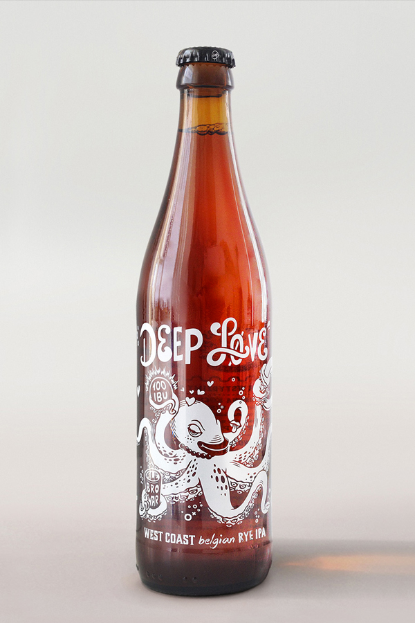
#2 – Deep Love IPA

2-deep-love-ipa

Deep Love is a Norwegian craft beer brand and much like Serpent Cider (above), the bottle also features an illustration of a sea monster (although it appears to be a beer-loving octopus, in this case).

According to the creators of the beer, it has a unique flavour, and therefore needed a unique packaging design to go along with it.

Rather than a simple beer label, this bottle actually features text and illustrations that have been printed directly onto the bottle itself. The result is a simple yet elegant design that certainly grabs the eye.

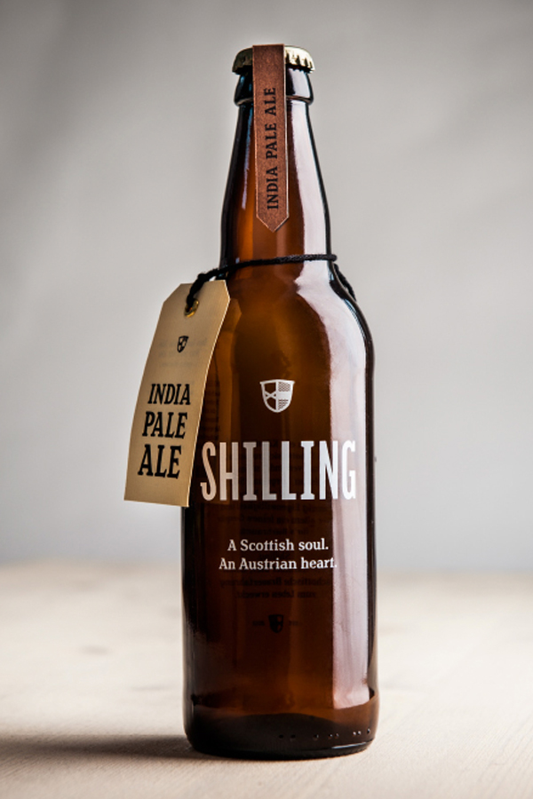
#3 – Shilling IPA

3-shilling-ipa

Shilling is a beer brand started by Uli Bacher and describes itself as having a “Scottish soul” and an “Austrian heart” – certainly a unique blend of characteristics for any beer.

Much like the Deep Love IPA (above), this beer also features a non-traditional label in the sense that there is no label; the branding is instead printed directly onto the bottle itself.

However, the bottle does also feature a couple of smaller labels – notably the “India Pale Ale” labelling at the top of the bottle, and a similar label attached by string (you can get beer and cider labels from fastlabels.co.uk or another similar printing company).

#4 – Hardside Cider

4-hardside-cider

Hardside Cider is a Virginia-based company with a passion for hard cider. However, this company doesn’t only produce apple cider, but also apricot cider and a number of other unique recipes.

No matter what flavour of cider you opt for, the labelling remains consistent and minimalistic. You can see from the two ciders pictured (apple and apricot) that the labels are virtually identical. Both feature the brand name, the location in which it was made, and a couple of pieces of other important information.

The only difference between the two bottles is the printed flavour (“apple” and “apricot” respectively), and the photograph of the fruit used in production.

#5 – Spontaneously Fermented Cider

5-spontaneously-fermented

Spontaneously Fermented Cider is a brand with simplicity at its heart, which is reflected in the beautiful bottle labels they use.

All four ciders/beers that are part of the Spontaneously Fermented Series are given Baroque style labels (see image above) and feature a minimal amount of written information (i.e. the name of the company, the alcohol percentage, and the flavour – that’s it).

Each label utilises only one colour (e.g. red, in the example above), although the bottle uses two shades of that colour (the darker shade for the label background, and the lighter shade for the design itself).

#6 – Rare Barrel – Sour Beer

6-rare-barrel

Rare Barrel is a small scale microbrewery, which exclusively brews sour beers (as they believe the process brews unique tasting beers); they’re based in Berkley, California.

With such a unique beer, Rare Barrel hired a graphic design company to create some unique bottle labels for the product. The brief was simple: celebrate the mixing of unique flavours in sour beers.

The result was this extremely colourful – yet also extremely simple – beer label that instantly grabs your attention. The minimalistic illustrations relate to the title of the beer (e.g. cosmic dust).

#7 – Super Jay American Pale Ale

7-super-jay

Super Jay hired the creative firm, PWW, to create these unique and minimalistic beer labels for their American Pale Ale.

These are perhaps one of the most simplistic labels on the list, as they feature nothing but the name of the company (Super Jay), the type of beer (American Pale Ale), and the company logo.

However, there is also the addition of two locations on the label (i.e. “LDN” and “NWT), as the Super Jay brand is all about combining different beers from different times/places.

#8 – Brooks Dry Cider

8-brooks-dry-cider

Brooks Dry Ciders not only feature beautifully simple bottle labels, but there’s also a fascinating backstory to them.

In 1846, the area north of San Francisco Bay, California was briefly under military control from a short-lived state named the California Republic. The California Republic may not have been around long, but it was around long enough to create its own flag, which featured an image of a grizzly bear.

With Brooks Dry Cider fermented brewed in Napa, California, the designers opted to use “Brooks the Bear” as a mascot for the brand; he now features on every bottle of cider doing various things (e.g. riding a motorcycle).

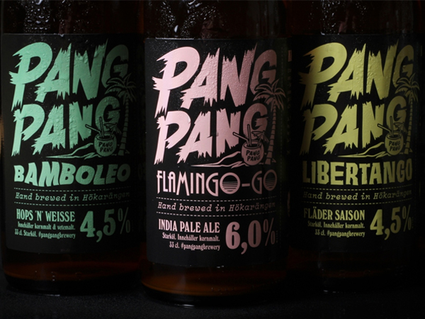
#9 – PangPang

9-pangpang

PangPang is a microbrewery based in Sweden, which produces a range of interestingly-titled beers, such as “Bamboleo”, “Libertango”, and “Tiki-Tango”.

Each of these beers are part of the brewery’s “Summer Series”, so it was important that the bottle labels not only represented the brand (which is far from “traditional”), but also the essence of summer.

Therefore, the designer opted to use bright, summery colours (e.g. blue, pink, yellow) for the beers. You’ll notice that only one colour is used per beer type, which helps to keep things clean and simple.

#10 – Hoogan’s Cider

10-hogans-cide

Hoogan’s Cider is an award-winning cider brand located in England, UK. All of their ciders are produced from fresh pressed English apples from orchards in Herefordshire, Gloustershire and Worcestershire.

The bottle labels for Hoogan’s cider are not only simple, but also remain consistent throughout the range of different ciders on offer (e.g. dry cider, medium cider, etc.). The only thing that changes on the labels is the colour scheme and the illustration of the fruit used to produce it (i.e. apple or pear).

It’s about as simple as it gets.

#11 – Left Field Cider Co.

11-left-field-cider

Left Field Cider Co. is a unique cider brand that was founded by two sisters; their ciders are brewed and bottled at a family ranch in Mamette Lake, BC.

Because the ranch produces different ciders at different times of the year, it was important that the bottle labels were adaptable for each cider. Therefore, the brand created this simple yet smart design that allows the batch number, year and blend details to be filled in by hand.

Save