Skip to content

Design Shard

Design Blog

  • Freebies
    Design Freebies such as free textures, paper textures, grunge textures, background images & stock images all for commercial use.
  • Tips & Tricks
    Read tips and tricks about a broad range of digital topics such as web design and branding
  • Inspiration
    Web design inspiration and ideas, collections of the best web designs from around the web and various other design inspirations
  • Tutorials
    Photoshop tutorials for web design and graphic design, photoshop photo effects tutorials, photoshop text effects and more
  • Contact us
  • Twitter

Tag: Logo

Can Your Logo Maker Do This: A Real Designer vs A Logo Maker

Can Your Logo Maker Do This: A Real Designer vs A Logo Maker


Every business needs a logo and all major ones will view it as a key aspect of their brand building.

A logo is the first impression a customer will get of your brand, so it has to look clean, professional and tell a story about who you are and what you do.

Which is why many view it as a first port of call within their brand building.

There are a number of ways you can create a logo, from a simple Photoshop job yourself to forking our thousands upon thousands on a graphic designer. But what is the best way to create a logo that will stick and go on to represent your brand for years?

Well, that depends on your budget but choosing between a logo maker and a graphic designer is certainly the most popular option.

Online Logo Makers

For a relatively cheap price you’ll be able to use a logo maker online to create a simple yet effective visual for your brand.

Logo makers like Tailor Brands are perfect for those building a brand on a budget or looking to get their brand of the ground quickly.

You can use basic software to create a logo in a matter of minutes, with the logo maker doing all the hard work so you can simply fill in our company details, then play around with colours, designs and font type to get a professional design perfect to get your business started.

You’ll generally find you’ll be mostly receive very simple designs back, but most design guidelines these days suggest a simple design is a must for a brand logo anyway.

All the world’s most recognisable brands have simple designs, allowing people to remember and memorise them meaning they instantly stand out in the marketplace.

It’s by far a cheaper option with most companies offering logo designs for as little as $3, while you can also add your logo to business cards, letterheads and branded presentations at a snip of the cost.

They’ll generally offer a number of services to coincide with this, however won’t be as personalised as you would find by employing a real-life logo designer and agency.

For a business on a budget though, they’re perfect.

Of course, we’re not suggesting you can build a multi-billion dollar brand with one at the forefront, you may have to rebrand when you get to that point, but they’re ideal for startups as the software used will certainly make your brand look professional and trustworthy.

The beauty of them is certainly the price, allowing you to do things such as shift your company logo colour with the seasons to make you more culturally aware, for example you could explore the rainbow colours for Gay Pride week, or change your logo green for World Environment Day.

Many brands do this, changing certain aspects of a businesses logo or branding. This will add conscience and personality to your brand, even with the most basic of designs.


Using a Real-Life Designer

If you’ve a large budget, then of course going to a real-life designer is certainly worthwhile.

First of all, you’ll have a continual dialogue with an expert in the field, meaning you’ll be able to detail all aspects of what you’d like within a logo in consultations.

This is the place where all the most instantly recognisable brands and beautiful logos are created. That ebb and flow will allow you to get exactly what you need but taking into account key elements of what makes brand logos successful.

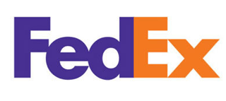
That will often come down to hidden meanings within a simple logo design, for example the white arrow within the FedEx logo or ‘Mom’ subtly inserted into the Wendy’s logo.

What’s more, you’ll also be able to push your design back and forth between client and designer in order to get it right, something which can’t be done when simply purchasing a quick logo.

Perhaps one of the biggest reasons why you may be better investing in a real-life designer is the fact that you’ll be able to make your logo unique.

While logo makers online are fantastic at turning around a logo professionally and quickly, if you’re looking for something that’s going to be unique and stand out hugely within a market, a designer is certainly better placed for you.

Essentially, you’re switching from a series of templates to a person designing from scratch. This means you can include anything you want from initials and acronyms to hidden meanings, suggestive colours and sparks of personality.

All the while you’ll be able to build a strategy on how your brand will evolve and in what manner you wish it to.

For example, the Adidas logo has many different ways in which it’s presented depending on where it is featured. With trademark three stripes, it could feature simply as that, in a pyramid above the brand name, or within the famous Trefoil.

Adapting your logo is a great way to get your brand recognised in various places, so building a flexible logo with a designer will help it fit in no matter where you wish to place it.

So, Which Do I Choose?

Ultimately how you produce your brand logo is very much dependent on the budget you attach with it.

There’s no reason you can’t use a logo maker to produce a cheap but professional logo, that could well stand the test of time.

However, if you’re looking for your logo to be filled with meaning, be completely unique and really stand out from the crowd then it is worth investing in. Yes, it may cost you thousands rather than a few dollars, but and instantly recognisable brand can make that money back in the long run.

If you need to start small, then a logo maker is certainly for you. Even if it’s just for the short term while your brand gets off the ground.


Posted on November 16, 2018Author Max StanworthCategories Tips & TricksTags Design, Logo
10 Things That Will Make Your Logo Look More Productive

10 Things That Will Make Your Logo Look More Productive

logo design

Forbes reveals in one of its articles that logos are the most important branding elements for a business. Logos don’t just create an identity for the company but also reflect its ideals, vision and culture to audience at large. Therefore, it’s important for any business, especially startups and small businesses, to invest in a logo design that’s unique, memorable and productive.

But we’re sure, you wouldn’t disagree that designing such logos isn’t an easy task. Obviously! There is much more to just having your name and a cool image/symbol in your logo.

Remember, first impression is the last impression! And quite often, logos make for a company’s first impression, one that influences their brand perception and reflects how serious and committed the company is. While there are many logos that have attained a cult status amongst masses, there are some that have not been able to make a mark at all.

So, if you too are at the helm of a startup and are looking to create a logo that adds value to your brand and become memorable so that even a toddler can recognize it from a distance, simply skim through these 10 easy to follow tips.

1. Make It Work Vertically and Horizontally

Web Designer Depot says that a logo should be simple enough to be easily recognized by anyone and everyone. It should be memorable. The orientation or the angle of the logo doesn’t really matter. All that matters is that it should feature something unique, something catchy and something that’s attention-grabbing right from the outset, without being drawn or sketched out in a complicated way. Remember, a complex or fussy logo does nothing except for confusing your target audience about your brand, your business, and your values.

google-analytics-icon

2. No Need of a Box

No, we don’t mean that you shouldn’t use boxes at all. But it pays to create a logo design that’s able to stand on its own, with or without a box. Though a box adds value to the overall voice of your logo design, it’s essential to ensure that its absence doesn’t diminish your logo’s charm in any way.


Yahoo_FB_Icon

3. Limit your Logo to Single Font

Having too many fonts can confuse and distract your target customers and project your brand as an inconsistent one. Smashing Magazine suggests you to try and use only one font (or two if you also have a tagline completing your logo). This will make your logo look more appealing. In fact, it’s the safest idea to effectively communicate your brand message and reflect the seriousness of your business. Do you know that a human attention span is even less than a gold fish? So, you get only eight seconds to becharm onlookers with your logo design. And that’s why it isn’t a good idea to mix too many fonts for it may clutter your logo elements and distract the onlookers.

gogle-logo

4. Make it Represent Your Business

Let’s start this point with an example: If you’re into educational business, you would obviously want an innovative and creative logo design that exude trustworthiness and sophistication. However, if you are into sports and fitness domain, it will need to represent endurance and strength. A logo represents your business image and personality in the market. Therefore, you must do well to ensure that your logo is designed in a way that it helps in clearly reflecting the nature of your business. The usage of fonts, colors, designs should all be appropriate and is accordance with your brand’s personality. Remember, your logo is an impression of what your company is all about!

444

5. Connect it With Your Brand—and Nothing Else

In simple words, the logo should be all about your brand and nothing else. The elements you use in your logo should be well-researched and at the same original and creative in equal measures. One should follow logo design trends. Steer clear of designers who plagiarize elements from historical symbols and other popular graphical elements. This results in creating a negative impact about your company before your target audiences.

555

6. Make Sure it’s Timeless

By being timeless, we mean that your logo must be capable enough to endure the test of time. Remember, the passage of time should not alter the quality of the logo. It must look trendy, no matter what year it is. Do well to cleverly craft a logo that remains unchanged and unharmed for years and decades. A timeless logo will show that you’re consistent with your quality and efficiency. Be advised that customers easily connect with logos that are consistent for a considerably longer period of time.

mcdonald

7. Maintain Versatility

Your logo design should be such that it looks good on anything, from posters to coffee mugs and from websites to printed materials. It should go unscathed when printed on billboards or on a stamp. Do well to ensure that it doesn’t follow a particular color scheme or pattern. It should look good on any background, be it black or white. For example, Apple’s logo looks good irrespective of the color scheme or the material it’s printed on.

wwf

8. It Should Appeal to All Age Groups

You cannot really succeed if anything you design is not flexible with people of all age groups. Remember, the spectrum of users that you are catering to is diverse and all of them have different tastes and preferences. Therefore, your logo must be designed in a way that it attracts everyone, from younger ones to the matured ones. Don’t be rigid in your designs. Leave room for flexibility.

Apple-logo

9. Don’t be Predictable

Yes, you don’t have to confuse your customers by making complex designs (as discussed above) but at the same time you should try to make your logo worth-watching. Your logo should not be too loud, but must evoke curiosity so that people look at it for longer time. Some of the world’s biggest brands opt for logos with hidden meanings to add that element of surprise for their visitors. For instance, FedEx logo features a hidden arrow in its wordmark symbol to represent its faster delivery and efficient services.

starbucks-logo

10. Be Simple

nike

Last but not the least, just keep it simple! Nobody is going to judge your typography skills by looking at your logo. So, relax! You don’t even have to have the name of your brand or caption in your design. Look at Nike! People remember its swossh symbol, no matter where they find it yet its considered as one of the well designed and popular sports logo. Remember, usually people don’t relate to the logos that are overtly complicated. Your logo isn’t the manifesto of your business. So, it’s important to keep it simple.

We’re sure that these easy to follow points will definitely help you understand how you can make your logo look more productive. So, brace yourself and design some stunning logos that will set you apart from the crowd of insipid and tasteless symbols and icons.


hands-people-woman-working

As always, please share your thoughts in the comments, if you enjoyed this post share it on twitter, and never hesitate to hit us up with any questions, critiques, or feedback. Don’t forget to sign up for ‘Design Instruct Weekly Newsletter’ to get more such interesting content delivered right to your inbox.

Save

Save

Save

Save

Save

Save

Save

Save

Save

Save

Save

Save

Posted on July 1, 2016Author Alice JacksonCategories Tips & TricksTags Branding, Inspiration, Logo
The Current Logo Design Trends of 2016

The Current Logo Design Trends of 2016

logo-designs

If you are wanting to create a professional logo design for 2016 – have a think about what’s already out there. Your business logo is part of your brand’s personality, let it speak for you!

Make 2016 the year for your logo rebrand. It doesn’t matter if you get it right the first time, look at brands like Apple and Virgin! Did you know that originally Apple’s business logo from 1976 was hand drawn picture of Isaac Newton? There he was sitting under a tree where an apple fell. The logo was much different from it’s now minimalist look and even had a quote: ‘A Mind Forever Voyaging through Strange Seas of Thought – Alone’. It wasn’t until Steve Jobs suggested that the logo may not be practical for the products they were creating until they thought about changing up their logo’s look. Apple thought about their product and how they could feature a logo on it that wouldn’t become outdated quickly. As we all know their current business logo is much more minimal – a simple metallic apple with a bite out of it.

Why 2016 trends are important for your business

Changing trends in the production of logos are frequent so it is always good to keep your eye on what is happening next. As your company grows, it will change and you will start to discover what your business’ identity is. As your company expands its personality will start to grow and values may change. Does this mean that your business logo design must change too? Potentially. Keep your business’ personality current and have a design of logo which reflects your company in 2016 – now twenty years ago. Does it have to change drastically? No, but make sure you not only interact with your customers through corporately but visually.

So why should your business keep up with the trends? If it’s not broke don’t fix it right? Wrong. Even companies like McDonalds – one of the world’s biggest and busiest food chains change up their business logo. McDonalds is a company which is great at living in the moment. McDonalds has not one, but four different logos! Each area used differently. There is the simple golden Masterbrand “M” arch which we all know and love! Then a similar arch with the “I’m Lovin’ It” tag which feeds off of their famous 2003 campaign. They also use “I’m Lovin’ It” and “McDonalds” in black text logos occasionally. Can you believe that The “I’m Lovin’ It” campaign launched in 2003 and McDonalds still uses the logo, this may be one of the most memorable campaigns in the past twenty years, could your company be next?

apple-iphone-books-desk

A new logo adds excitement to a brand and a touch of freshness and like McDonald you do not need to do it yearly, but by changing it up once or twice it isn’t as noticeable but creates a spark about the brand. Remember although you are changing your logo it should still mean something to you and your customer. A good logo can speak a thousand words to your customer so make sure you create something which speaks the truth about your business. Don’t create something trendy which has no meaning to your business, this may confuse your customer and they may end up thinking you are a completely different company. This is the same as adjusting adding something fancy to a logo that is already poor designed – in that case you may be as well to start from scratch. Starting from the beginning works for unestablished brands whose business may not be taking off as well as they would life. However, if a company like Apple were to completely redesign their logo in 2016, not only would it cost them millions of pounds to rebrand but would annoy a lot of their customers – this is why having a great logo from the get go is so important.

Minimalist Logos

Minimalism isn’t something that has appeared overnight. This logo design concept has been growing over the past few years and has been seen in everything from art, fashion to interior design. Web design has also taken on the trend and many sites have begun to strip back since this trend picked off in 2014 and now it is reflected in the strong desire for minimalism in logos this year.

Minimalism is usually a flat design that uses as few or just 1 colour. This means that the logo is the main priority and works for big fashion brands like Chanel and Celine – their logos do not need to be to be flashy as they already have a reputation of high-end brand.

When Phoebe Philo joined French designed Celine in 2008 she wanted to strip back on the fashion design: “I just thought I’d clean it up, make it strong and powerful – a kind of contemporary minimalism.” She also applied this approach to their company’s logo. The Celine logo was already all in capital letters but Philo directed that it was refined further under. When designing the logo Peter Miles an art direct designer from New York who assisted in the design claimed that: “I don’t think I’ve ever worked with anyone so precise and detailed as Phoebe …She sees things microscopically. ‘Can you just make the logo two millimetres shorter?’ ‘Can you move it down there by three millimetres?’ I had to change things by the smallest margins… but always for good reason”.

As one of the biggest fashion brands in the world – take note that your business logo is so important! Use a simple style, create a straight-to-the-point design and apply it to your brand! A top tip for using your logo online! In blogging and eCommerce, it may be an idea to create a website design which is mainly while – to create focus on the logo and the brand. This works well for plain black text business logo.

image003

Hand drawn Logos

Technology may be taking over but keeping it authentic is a big trend for logos in 2016. Do you love the fresh look of a hand drawn font or logo? Virgin’s logo has kept its hand drawn since it’s rebrand in the 1970s. The myth that surrounds Virgin’s logo is that a young designer scribbled, what is now iconic signature, on a paper napkin! Richard Branson chose this design due to its ‘in your face’ straightforwardness, passion and energy. Due to the era it was born, this punk inspired, hand written logo is known and loved worldwide. Virgin has expressed that it represents the “exciting, ever-disrupting world of Virgin and adorns everything from planes and trains to health clubs and banks”. Perhaps this is why hand-drawn style is still trendy in 2016? hand written fonts bring a personal aspect to company as consumers enjoy the connection they feel to it.

Virgin is a brand which is hugely involved with its customers and are renowned for their good customer service. Hand written fonts are great for companies who want to connect with their consumers and also for brands that don’t need to be too serious and want to take a lighter approach when it comes to branding. This style also allows designers to be more creative with colour, tone and design.

Line Art Trend

Is less more when it comes to logos? Line art is a big trend in 2016 and it can be seen from catwalks to tattoo art to of course – logos! This trend was popular in 2015 and it looks like it is here to stay.

If your business is inspired by art and design, then monolines could be the option for your business logo. The term “monolines” comes from the single, thin lines that are used in the designs. This line is usually the same thickness throughout the design and normally the one solid colour – black.

This trend can usually have been seen in restaurant or coffee industry. As mentioned time and time again in the graphics, simple can be most effective. However, this type of style can be as fun as you want it to be – use your imagination.

Modern Retro/Vintage Designs

Another trend which is back from 2015 is vintage! This is great news if you like the combination of modern flat styles of today matched with shapes and styles that have been seen in older logos. We love this fresh take on a traditional style, which can always be a great way to combine things you already know and turn them into something no else has seen.

Vintage style may not be as sleek as other styles such as minimalism but that’s the thing with this trend they are striking and definitely will catch your consumer’s eye at first glance. Looking at these designs for the first time allows the customer to get a really good feel about what your brand is about and works will for businesses that have a quirkier personality.

Letterstacking

Letterstacking is a forecasted trend for 2016. This is a trend that has come and gone in the past but it slowly but surely gaining its popularity back. It can be argued that these trickier business logos do gain the attention of the consumer by drawing then in and making them figure out what it is they are trying to say.

These type of logos appeal to a consumer who enjoys a challenge – someone who likes to break things down, re-arrange them and create something of their own. If you want a mainly text based logo then this is the style for you. Perfect for any creative business – it offers consumers the chance to breakdown what the companies message in what designers call text bytes. We love this look because it both stylish and out of the book, if you are looking for something different this may be the way to go!

image005

Negative Space Logos

Negative Space is one of our favourite logo concepts, not just for 2016, but for every year! Think of the WWF panda – yes you know the one! The WWF Panda is a gorgeous design and another great example of how a company can use an iconic image to attract its consumers.

Negative space will continue to amaze in 2016. The concept behind this design is that it may not be something you see first, but when you sit it, it speaks to you and you understand what it is saying. That is what makes this type of design work. By looking closer at the design the consumer is able to pick up on a deeper message and your business logo becomes much more special. This is why negative space will continue to lure many more businesses to explore its strengths.

Kinetic logos

If you don’t know what a kinetic logo is think of Nickelodeon’s bright orange logo. Also known as Dynamic logos, kinetic logos adjust and change but elements of it will stay the same. This idea is appealing for a business logo that works well but needs to freshened up slightly. This style of logo also has become a good way of summing up information about the company in “byte-sized” pieces.

The Kinetic logo is able to make consumers automatically see what the direction of the company or brand is whilst in real-time. Make sure the message of the company is not lost whilst experimenting with a kinetic business logo.

Google is a logo which is a great example of this as it changes daily with regards to any events, birthdays or an anniversary that occur on that day. The Google Doodle fascinates the consumer because it is constantly changing – however it looks the same, meaning that nothing about the brand has. This trend is one of the most competitive as it needs to live up to its consumer’s expectations and consistently provide something new.

image007

Keep it simple

The main thing to remember from this article is to keep it simple! Don’t get too complicated with your business logo. Lots of corporate logos are moving away from text and using icons. With the digital age moving forward and app development in business taking off – get used to knowing companies by their business logo. Look at Twitter and Target for examples of this. Are you thinking of rebranding and looking for inspiration?

Posted on June 2, 2016June 3, 2016Author Melissa LangCategories InspirationTags Logo, Trends1 Comment on The Current Logo Design Trends of 2016
Proudly powered by WordPress