Forbes reveals in one of its articles that logos are the most important branding elements for a business. Logos don’t just create an identity for the company but also reflect its ideals, vision and culture to audience at large. Therefore, it’s important for any business, especially startups and small businesses, to invest in a logo design that’s unique, memorable and productive.
But we’re sure, you wouldn’t disagree that designing such logos isn’t an easy task. Obviously! There is much more to just having your name and a cool image/symbol in your logo.
Remember, first impression is the last impression! And quite often, logos make for a company’s first impression, one that influences their brand perception and reflects how serious and committed the company is. While there are many logos that have attained a cult status amongst masses, there are some that have not been able to make a mark at all.
So, if you too are at the helm of a startup and are looking to create a logo that adds value to your brand and become memorable so that even a toddler can recognize it from a distance, simply skim through these 10 easy to follow tips.
1. Make It Work Vertically and Horizontally
Web Designer Depot says that a logo should be simple enough to be easily recognized by anyone and everyone. It should be memorable. The orientation or the angle of the logo doesn’t really matter. All that matters is that it should feature something unique, something catchy and something that’s attention-grabbing right from the outset, without being drawn or sketched out in a complicated way. Remember, a complex or fussy logo does nothing except for confusing your target audience about your brand, your business, and your values.
![]()
2. No Need of a Box
No, we don’t mean that you shouldn’t use boxes at all. But it pays to create a logo design that’s able to stand on its own, with or without a box. Though a box adds value to the overall voice of your logo design, it’s essential to ensure that its absence doesn’t diminish your logo’s charm in any way.
3. Limit your Logo to Single Font
Having too many fonts can confuse and distract your target customers and project your brand as an inconsistent one. Smashing Magazine suggests you to try and use only one font (or two if you also have a tagline completing your logo). This will make your logo look more appealing. In fact, it’s the safest idea to effectively communicate your brand message and reflect the seriousness of your business. Do you know that a human attention span is even less than a gold fish? So, you get only eight seconds to becharm onlookers with your logo design. And that’s why it isn’t a good idea to mix too many fonts for it may clutter your logo elements and distract the onlookers.

4. Make it Represent Your Business
Let’s start this point with an example: If you’re into educational business, you would obviously want an innovative and creative logo design that exude trustworthiness and sophistication. However, if you are into sports and fitness domain, it will need to represent endurance and strength. A logo represents your business image and personality in the market. Therefore, you must do well to ensure that your logo is designed in a way that it helps in clearly reflecting the nature of your business. The usage of fonts, colors, designs should all be appropriate and is accordance with your brand’s personality. Remember, your logo is an impression of what your company is all about!

5. Connect it With Your Brand—and Nothing Else
In simple words, the logo should be all about your brand and nothing else. The elements you use in your logo should be well-researched and at the same original and creative in equal measures. One should follow logo design trends. Steer clear of designers who plagiarize elements from historical symbols and other popular graphical elements. This results in creating a negative impact about your company before your target audiences.

6. Make Sure it’s Timeless
By being timeless, we mean that your logo must be capable enough to endure the test of time. Remember, the passage of time should not alter the quality of the logo. It must look trendy, no matter what year it is. Do well to cleverly craft a logo that remains unchanged and unharmed for years and decades. A timeless logo will show that you’re consistent with your quality and efficiency. Be advised that customers easily connect with logos that are consistent for a considerably longer period of time.

7. Maintain Versatility
Your logo design should be such that it looks good on anything, from posters to coffee mugs and from websites to printed materials. It should go unscathed when printed on billboards or on a stamp. Do well to ensure that it doesn’t follow a particular color scheme or pattern. It should look good on any background, be it black or white. For example, Apple’s logo looks good irrespective of the color scheme or the material it’s printed on.

8. It Should Appeal to All Age Groups
You cannot really succeed if anything you design is not flexible with people of all age groups. Remember, the spectrum of users that you are catering to is diverse and all of them have different tastes and preferences. Therefore, your logo must be designed in a way that it attracts everyone, from younger ones to the matured ones. Don’t be rigid in your designs. Leave room for flexibility.

9. Don’t be Predictable
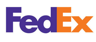
Yes, you don’t have to confuse your customers by making complex designs (as discussed above) but at the same time you should try to make your logo worth-watching. Your logo should not be too loud, but must evoke curiosity so that people look at it for longer time. Some of the world’s biggest brands opt for logos with hidden meanings to add that element of surprise for their visitors. For instance, FedEx logo features a hidden arrow in its wordmark symbol to represent its faster delivery and efficient services.

10. Be Simple

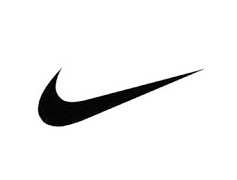
Last but not the least, just keep it simple! Nobody is going to judge your typography skills by looking at your logo. So, relax! You don’t even have to have the name of your brand or caption in your design. Look at Nike! People remember its swossh symbol, no matter where they find it yet its considered as one of the well designed and popular sports logo. Remember, usually people don’t relate to the logos that are overtly complicated. Your logo isn’t the manifesto of your business. So, it’s important to keep it simple.
We’re sure that these easy to follow points will definitely help you understand how you can make your logo look more productive. So, brace yourself and design some stunning logos that will set you apart from the crowd of insipid and tasteless symbols and icons.

As always, please share your thoughts in the comments, if you enjoyed this post share it on twitter, and never hesitate to hit us up with any questions, critiques, or feedback. Don’t forget to sign up for ‘Design Instruct Weekly Newsletter’ to get more such interesting content delivered right to your inbox.
