Beers and ciders that are consumed by most people around the world are nothing special; they’re mass-produced in large factories with little/no variation in flavour between each batch.
Typically, the bottle labels are the same as the beer: boring, plain, and offer no real sense of personality behind the brand. It’s usually all about packing as many colours and as much information as possible on to the label in the hope that the brand will stand out on the supermarket shelves.
However, if you look at the craft beer (and cider) market, you’ll notice something quite interesting: not only are the beers generally better quality, but a lot of the bottle labels are quite simple, minimalistic, and pay homage to the brewery and/or brewers.
I thought it would be nice to showcase some of these labels, so I’ve rounded up some of my personal favourites below.
#1 – Serpent Cider

Serpent Cider is a product originating from Okanagan Valley, British Columbia, and as you can see, the labelling manages to be extremely colourful and flamboyant, while still maintaining it’s minimalism.
The design itself features an illustration of Ogopopo; a monster that is reported to live in the Okanagan Lake. You’ll notice that there is a small paragraph of text on the back of the bottle explaining the legend of the monster.
Interestingly, the bottle only makes use of blue, green and red (which helps to maintain the simplicity).
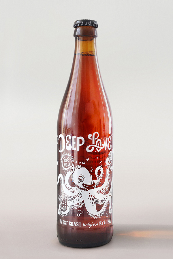
#2 – Deep Love IPA

Deep Love is a Norwegian craft beer brand and much like Serpent Cider (above), the bottle also features an illustration of a sea monster (although it appears to be a beer-loving octopus, in this case).
According to the creators of the beer, it has a unique flavour, and therefore needed a unique packaging design to go along with it.
Rather than a simple beer label, this bottle actually features text and illustrations that have been printed directly onto the bottle itself. The result is a simple yet elegant design that certainly grabs the eye.
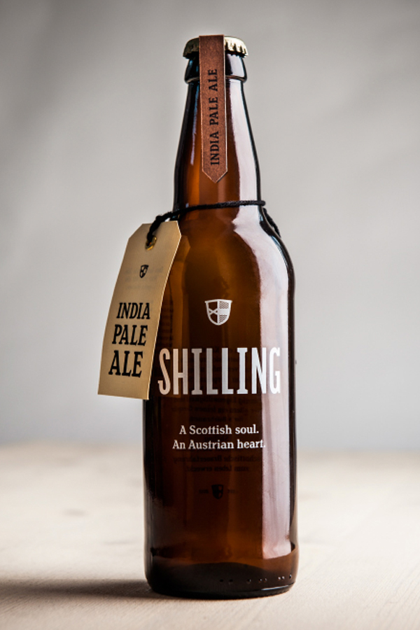
#3 – Shilling IPA

Shilling is a beer brand started by Uli Bacher and describes itself as having a “Scottish soul” and an “Austrian heart” – certainly a unique blend of characteristics for any beer.
Much like the Deep Love IPA (above), this beer also features a non-traditional label in the sense that there is no label; the branding is instead printed directly onto the bottle itself.
However, the bottle does also feature a couple of smaller labels – notably the “India Pale Ale” labelling at the top of the bottle, and a similar label attached by string (you can get beer and cider labels from fastlabels.co.uk or another similar printing company).
#4 – Hardside Cider

Hardside Cider is a Virginia-based company with a passion for hard cider. However, this company doesn’t only produce apple cider, but also apricot cider and a number of other unique recipes.
No matter what flavour of cider you opt for, the labelling remains consistent and minimalistic. You can see from the two ciders pictured (apple and apricot) that the labels are virtually identical. Both feature the brand name, the location in which it was made, and a couple of pieces of other important information.
The only difference between the two bottles is the printed flavour (“apple” and “apricot” respectively), and the photograph of the fruit used in production.
#5 – Spontaneously Fermented Cider

Spontaneously Fermented Cider is a brand with simplicity at its heart, which is reflected in the beautiful bottle labels they use.
All four ciders/beers that are part of the Spontaneously Fermented Series are given Baroque style labels (see image above) and feature a minimal amount of written information (i.e. the name of the company, the alcohol percentage, and the flavour – that’s it).
Each label utilises only one colour (e.g. red, in the example above), although the bottle uses two shades of that colour (the darker shade for the label background, and the lighter shade for the design itself).
#6 – Rare Barrel – Sour Beer

Rare Barrel is a small scale microbrewery, which exclusively brews sour beers (as they believe the process brews unique tasting beers); they’re based in Berkley, California.
With such a unique beer, Rare Barrel hired a graphic design company to create some unique bottle labels for the product. The brief was simple: celebrate the mixing of unique flavours in sour beers.
The result was this extremely colourful – yet also extremely simple – beer label that instantly grabs your attention. The minimalistic illustrations relate to the title of the beer (e.g. cosmic dust).
#7 – Super Jay American Pale Ale

Super Jay hired the creative firm, PWW, to create these unique and minimalistic beer labels for their American Pale Ale.
These are perhaps one of the most simplistic labels on the list, as they feature nothing but the name of the company (Super Jay), the type of beer (American Pale Ale), and the company logo.
However, there is also the addition of two locations on the label (i.e. “LDN” and “NWT), as the Super Jay brand is all about combining different beers from different times/places.
#8 – Brooks Dry Cider

Brooks Dry Ciders not only feature beautifully simple bottle labels, but there’s also a fascinating backstory to them.
In 1846, the area north of San Francisco Bay, California was briefly under military control from a short-lived state named the California Republic. The California Republic may not have been around long, but it was around long enough to create its own flag, which featured an image of a grizzly bear.
With Brooks Dry Cider fermented brewed in Napa, California, the designers opted to use “Brooks the Bear” as a mascot for the brand; he now features on every bottle of cider doing various things (e.g. riding a motorcycle).
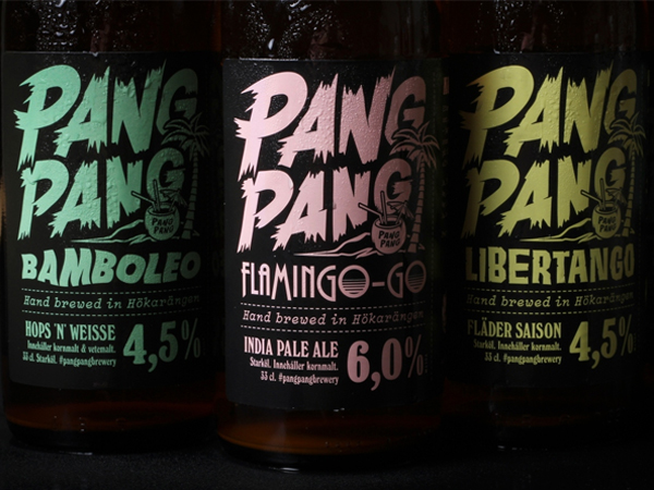
#9 – PangPang

PangPang is a microbrewery based in Sweden, which produces a range of interestingly-titled beers, such as “Bamboleo”, “Libertango”, and “Tiki-Tango”.
Each of these beers are part of the brewery’s “Summer Series”, so it was important that the bottle labels not only represented the brand (which is far from “traditional”), but also the essence of summer.
Therefore, the designer opted to use bright, summery colours (e.g. blue, pink, yellow) for the beers. You’ll notice that only one colour is used per beer type, which helps to keep things clean and simple.
#10 – Hoogan’s Cider

Hoogan’s Cider is an award-winning cider brand located in England, UK. All of their ciders are produced from fresh pressed English apples from orchards in Herefordshire, Gloustershire and Worcestershire.
The bottle labels for Hoogan’s cider are not only simple, but also remain consistent throughout the range of different ciders on offer (e.g. dry cider, medium cider, etc.). The only thing that changes on the labels is the colour scheme and the illustration of the fruit used to produce it (i.e. apple or pear).
It’s about as simple as it gets.
#11 – Left Field Cider Co.

Left Field Cider Co. is a unique cider brand that was founded by two sisters; their ciders are brewed and bottled at a family ranch in Mamette Lake, BC.
Because the ranch produces different ciders at different times of the year, it was important that the bottle labels were adaptable for each cider. Therefore, the brand created this simple yet smart design that allows the batch number, year and blend details to be filled in by hand.
Save


